
This article first appeared in volume 12 of eg, the Experiential Graphics Magazine, a publication of the SEGD. Read the PDF version eg12_Internet_Place.
“You are here.” The blue dot in the center of your smartphone’s map has a beat of its own, pulsating with each dispatch from the constellation of satellites above. It skips modestly on top of the city grid, an avatar that engenders confidence and courage as we navigate unfamiliar terrain.
The route from gas-station maps to MapQuest printouts to GPS-enabled apps has been a fast trip, just about a decade’s sprint for most of us. Now our personal wayfinding device is our smartphone, with its GPS chip, Internet connection, and a seemingly endless cache of accurately rendered maps. But its most powerful feature is that blue dot—it provides the context we need to comprehend where we are and how to get where we want to go.
Today’s experience designers and technologists are taking two major paths to cultivate our contextual understanding of the environment: making our smartphones smarter and making particular locations smarter.
Smarter phones are on the way, packed with sensors that see in three dimensions, perceive when we are walking, running, or driving, and anticipate just the right moment to take that photo. The aim of Google’s Project Tango is nothing less than endowing “mobile devices with a human-scale understanding of space and motion.” Tango devices (still in development) will map and render surroundings in real-time and augment them with contextual information, giving us perhaps the most panoramic and insightful view of our world to date.
Smart station platforms
We’ve heard of smart cities and smart buildings, but how do you embed intelligence into a public gathering place or a transit hub? And how do you determine what information your visitors need?
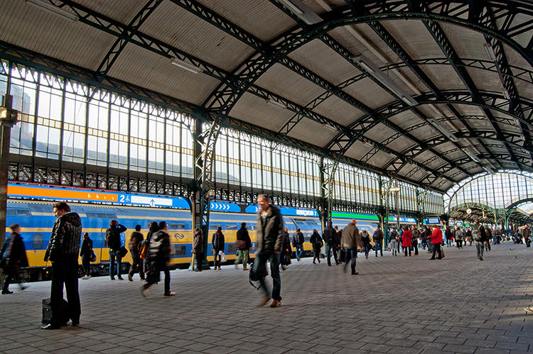
Sometimes a more pragmatic query leads to an unexpectedly “smart” solution. NS Dutch Railways and its sister company ProRail posed the question: How can we make our rail platforms safer and more efficient for passengers to navigate? The pressing issue was Ultrecht Central Station, the largest in Amsterdam and a major European transit hub serving 285,000 daily passengers. It was scheduled to undergo a monumental multi-year renovation, and planners wanted to make sure construction did not impede passenger flow.
The rail companies selected design research consultancy STBY (pronounced “standby”) of London and Amsterdam to begin the inquiry. STBY researchers shadowed passengers on their journeys, culled through quantitative ticket data, and observed pedestrian traffic through and in the station.
They distilled all their research into problem areas, the most acute being “the scramble moment,” when the train doors open and passengers enter and exit. The few minutes between arrival and departure were fraught with anxiety: which cars have seating? Where can I board with my bike? Is this first or second class?
As STBY design researcher Marie de Vos explains, “this is the moment when a lot of time is getting lost… Time is money, so if we can make it quicker and more comfortable for the train travelers, that would be great for the client as well.”
STBY’s comprehensive research narrowed the problem from the intangible “make it easier ” to a concise creative brief: “give departing passengers helpful information about the incoming train composition as early as possible.” Dutch design firm Edenspiekermann (founded by German typographer Erik Spiekermann) joined STBY to collaborate on conceptual solutions, all of which required massive data infrastructure to implement.
Joost Holthuis, partner at Edenspiekermann, recalls that nearly half of all resources on the project were devoted to overcoming technical and operational challenges. NS Dutch Railways and its engineering partners installed infrared sensors inside train cars above the doors to count people entering and exiting by tracking body heat. Along with train configuration data, the real-time capacity information would help passengers decide where to board the train.
The result is a 590-foot-long LED ribbon suspended on the Ultrecht Central Station platforms just above the track threshold. Ten minutes before the train arrives, it broadcasts everything passengers need to know about the approaching train including where the doors will open, seating capacity by car (color-coded red, orange, green), and special entrances. These ribbons will be rolled out to all major stations over the next few years.

The same information will be available in the next release of NS Dutch Railways’ mobile app, but the key to resolving this problem was embedding the information displays at the scramble points themselves, distilling sensor and service data into helpful on-the-spot guidance.
As Holthuis explains, “Our pilot showed that apps are mainly used in passive situations were you have time to watch your device. In crowded and stressful situations when you have to hurry and carry bags, it’s difficult to use a device. In the user testing, the screen above the platform turned out to be more effective in the hassle of boarding.”
Digitizing Vignelli’s vision for the NYC subway
In February 2012, New York’s Metropolitan Transportation Authority (MTA) issued a bold public challenge: “Develop a strategy that will ensure a viable, maintainable, cost effective customer information system supported by advertising for the foreseeable future.”
Nearly three years later, 145 touchscreen kiosks inhabit 30 of the system’s busiest stations. Each poster-sized, stainless steel-clad touchscreen dispenses real-time wayfinding guidance, interlaced with sponsored messages, to masses of transit riders.
New York-based Control Group is one of the two companies MTA selected for the pilot study now underway. Design Director Paul McConnell acknowledges the competition is a “bakeoff,” with MTA rider experience teams evaluating the pilot deployments designed by his firm and rival CBS Outdoor. (They share the same enclosures designed by Antenna Group for an earlier system.) A single victor will be awarded the contract at the end of 2015.
The MTA is North America’s largest transportation network, shuttling more than 8 million passengers a day via subways, busses, and railroads. Over the years, the authority had deployed a number of digital signage projects such as digital overheads on platforms and outdoor displays at subway entrances. Few installations shared the same visual vocabulary and content sources, and as McConnell explains, “that operational inconsistency depleted rider confidence in the system.”
Control Group’s plan was to create a systematic and cohesive design and interaction language tuned to the demands of riders and the form factor of the kiosk. “We wanted to deliver helpful information within a five to ten-second interaction, minimizing time and touches.” When not in use, the screens offer relevant information at a glance: next arrivals, connections, and service interruptions along with ad segments.
To meet the requirement that the system be primarily self-funded, Control Group had to delve into service design and business planning. “There’s a lot of blur between user experience, technology, and just getting stuff done. If you’re a designer, you have to consider the business problem,” says McConnell.
New York City MTA "On the Go" Information Kiosks from Control Group on Vimeo.
As the bakeoff continues, McConnell imagines an even more strategic project: “Just like Massimo Vignelli simplified the chaos of subway signage with the 1970 Graphic Standard Manual, it would be a thrill to draft the guidelines for the next wave of digital communication.”
Flight information at a glance
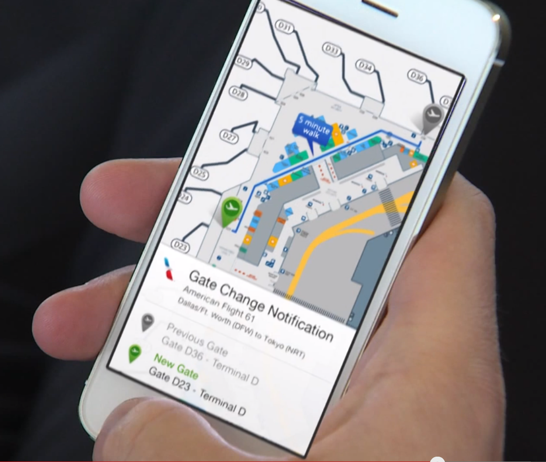
Screens aren’t the only way to make an environment smarter. Fort Worth-based American Airlines is in the midst of a study to test iBeacons that provide contextual wayfinding information to users of their app. Over a hundred beacons have been installed on walls and ceilings of Terminal D at Dallas/Fort Worth International Airport. The devices use Bluetooth Low Energy (BLE) to generate relevant messages on passengers’ devices.
Phillip Easter, director of mobile apps and wearables for American, explains that the system is designed to answer a few of passengers’ most urgent questions: “Am I at the right gate? If I’m at the wrong gate, how do I get to the right gate? And what amenities are around me?”
“Beacons offer a great deal of opt-in convenience,” he continues. “We want passengers to know where they are and we’ll let them know when there’s something important” like a boarding announcement or gate change. Plus, gate agents can manage their flights more proactively when they know where passengers are.
His team had been exploring indoor navigation technology for years, but it wasn’t until Apple launched the iBeacon platform in 2013 that all the pieces fell into place: “These are exciting times—the technology is very accurate, low cost to maintain, and tuned to the majority of our customers who use our app on Apple devices.” Beacons cost less than $20 a piece, their batteries last for 3 years, and a team can install a terminal’s worth in the course of an evening.
When you use an app that has been built to communicate with beacons, your smartphone “listens” for beacon transmissions and displays relevant messages or features when you approach the range of a beacon associated with that app. All interactions with beacons are opt-in, so these are secure and private interactions.
Over the course of the six-month pilot, selected users of the American Airlines app are invited to try out the new location-based features, such as navigating from point to point with the aid of the blue dot. With customer input, Easter and his team are developing valuable insights into how people navigate by smartphone. “People are walking, not looking down that much, and we can’t require them to engage. We can’t show too much information and we must make sure what we do show is hyper-accurate.”
The system and new versions of the Android and iOS American Airlines app will roll out to major hubs this year.
American is the first airline to partner with Apple on Apple Watch apps. “There are countless opportunities when you combine beacons with wearables—we will be able to provide snippets of glance-able information just when you need it,” notes Easter. He takes inspiration from Apple: “Do something simple and make it work all the time.”
Alleviating anxiety for non-English speakers
Passengers on trains, subways, and airplanes may be jittery about making their connections, but visitors to hospitals often face a much higher level of anxiety. Few places are as confusing as hospital facilities: intimidating acronyms and maze-like corridors and contiguous buildings baffle first-time visitors.
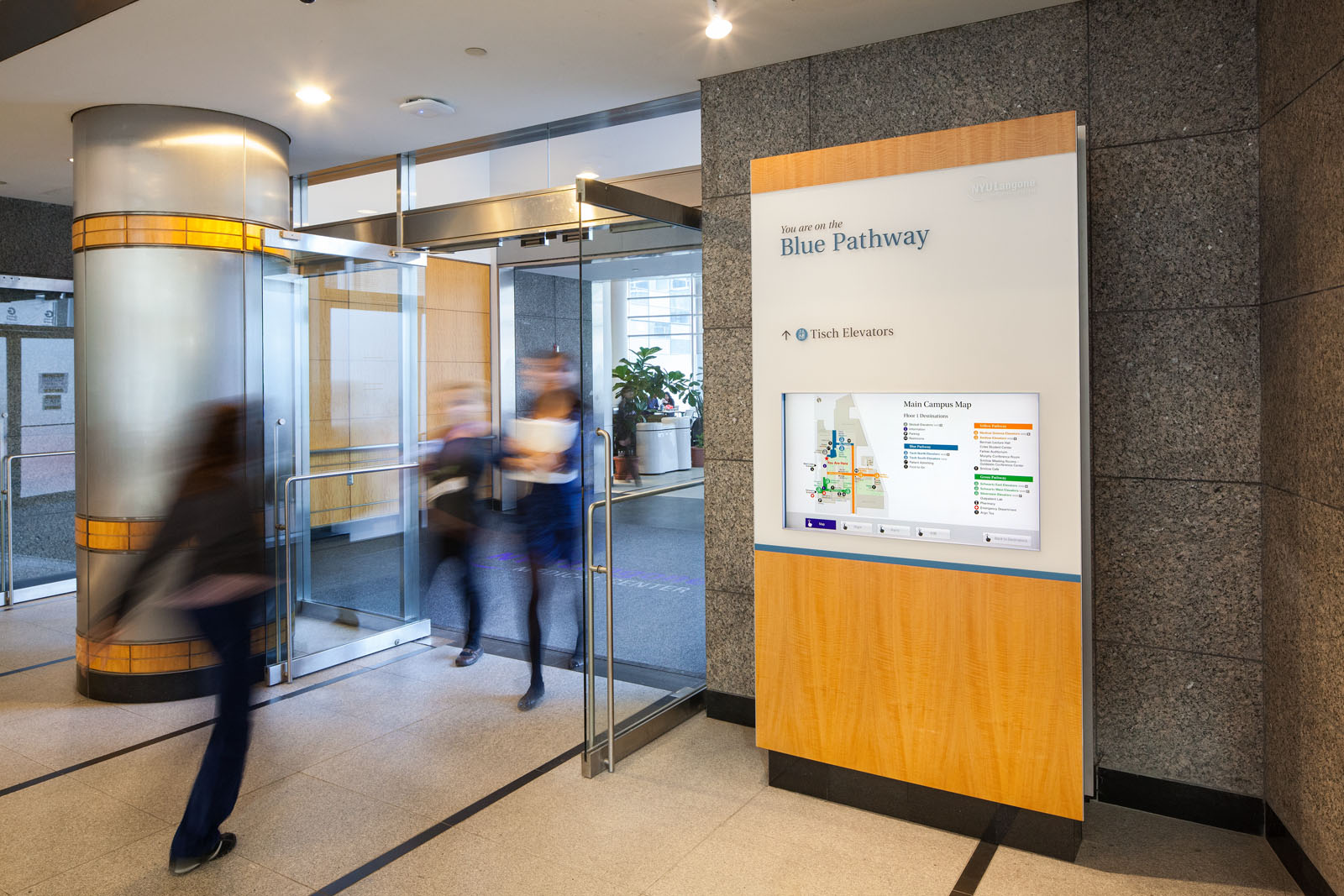
Every year, hundreds of thousands of people visit New York University Langone Medical Center (NYULMC)—the four-block-long medical complex on First Avenue. The campus is anchored by Tisch Hospital and flanked by NYU Medical School facilities and physician offices. Rising to the north is Kimmel Pavilion, a major expansion of inpatient and outpatient facilities that will open in 2017.
In 2008, the medical center launched an initiative entitled “Campus Transformation,” an across-the-board effort to improve the patient experience through expansions in facilities, services, and supporting technical infrastructure. Administrators selected New York-based design firm Two Twelve to develop a wayfinding strategy as part of the effort.
NYULMC’s chief executive officer Dr. Robert Grossman defined Two Twelve’s scope as “much broader than standards for signage, integrating all the tools needed to reassure our visitors that they’ve come to the right place and can easily reach their destination.”
As Two Twelve founder and principal David Gibson explains, “Our solution was to design an integrated and cohesive wayfinding system composed of both traditional and digital tools specifically designed to overcome the unique challenges of the environment and the visitors that traverse within it.”
A primary goal was to help NYULMC’s large population of non-English speakers. The medical center offers on-site interpretation services in many languages, with the top three languages consistently ranking as Spanish, Mandarin Chinese, and Russian. In 2012 alone, interpreters assisted in about 30,0000 encounters with speakers of these languages.
To help these visitors self-navigate, Two Twelve designers, led by creative directors Anna Sharp and Laura Varacchi, came up with an innovative blend of static and digital signage they named the “digital pylon.” Positioned at decision points on the ground floor of the Medical Center, these monoliths direct visitors to ground-floor destinations. On the embedded digital screens, directions to nearby destinations are shown in English, with their equivalents rotating in the three major languages. Buttons on the bottom of the screen allow visitors to skip ahead to their preferred language. They can also click on any destination to display a map to it in their preferred language.
The Two Twelve team collaborated with the consultancy Citizen Design Research headed by Sylvia Harris to test several iterations of prototypes with non-English visitors. Gibson recalls the value of taking time to test the concept: “For example, we witnessed the growing expectations we all have of touchscreens as information devices.”
Today, the pylons are in place and while they provide non-English speaking visitors with directions, they also broadcast the larger message that NYULMC welcomes and serves patients from around the world. Upcoming expansions to the digital wayfinding suite will include wayfinding kiosks, a wayfinding section of the institution’s website, and a content management tool to manage all the information.
An embedded future
As designers, technologists, and owners collaborate to embed intelligence into the places we visit, we become more confident in our travels and grasp a more accurate—and perhaps deeper—understanding of our place in the world.
Leslie Wolke is a wayfinding technology consultant and writer based in Austin, Texas. She is collaborating with Two Twelve on the NYULMC project described in this story.

Leave a comment