SEGD’s Newest Fellow on Design, Cities, and Storks
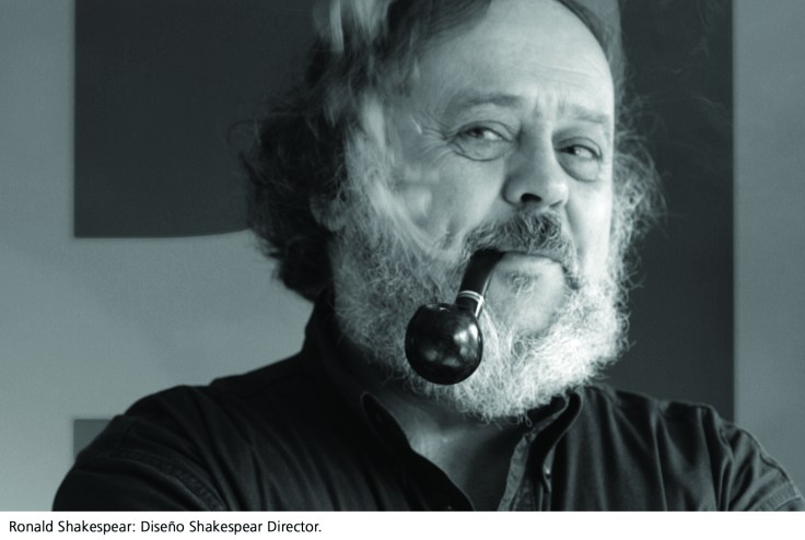
Ronald Shakespear, recipient of the 2008 SEGD Fellow Award, has described his profession as “making the city legible.” With his sons Lorenzo and Juan and daughter Barbara, his family-owned design consultancy Diseño Shakespear has earned an expertise in mega-projects in Buenos Aires. While most of their work has been in Argentina, their reputation is a global one, with published projects in design journals such as Communication Arts, Ottagono, Taschen’s Latin American Design, Print and Novum. The list of accolades continues with exhibits of Diseño Shakespear work at the Centre Georges Pompidou, Paris, the AIA Branch House, Richmond, the Katzen Arts Center, Washington, and at the Triennale da Milano in Italy.
Throughout his 50-year career, Ronald Shakespear has played the role of an educator as frequently as he has played the role of a designer. Having lectured in Latin America, Canada, Europe, and the U.S., his most enduring teaching relationship has been with the University of Buenos Aires as head professor in the division of Architecture, Design and Urbanism. As President of ADG, Asociación de Diseñadores Gráficos de Buenos Aires and founder of Espacio Diseño, the first permanent design exhibition in Buenos Aires, his impact on the city’s design community and the next generation of designers is prodigious.
A sampling of their major cultural and public works include:
• Wayfinding, identification and branding program for the Subte, the Buenos Aires subway system. (As featured in segdDESIGN Issue 20.)
• Wayfinding Program for Buenos Aires Public Hospitals. This project began with one local hospital and ended with the implementation of that system as part of the city’s Hospital Remodeling Plan. Ronald and his brother Raul devised a dense grid and a simple palette of red (for icons) and blue (for directional information) on fields of white. Within these limitations — and with a total of nearly 80 pictograms they were able to convey all the messages within the complex environment of a hospital.
• Identity Systems for Argentine Icons. Open a guidebook to Buenos Aires and the list of must-see destinations parallels the Diseño Shakespear portfolio. The studio has designed identities for Argentina’s favorite soccer team, BOCA, most elaborate opera house, Teatro Colon and a coastal tourist train, Tren de la Costa, among others.
• City of Buenos Aires Signage Master Plan. In 1971, City Hall enlisted Diseno Shakespear to draft a visual plan for Buenos Aires. Simply put, their task was to create sign standards for the city itself: from bus stops to street signs to taxi stands. A challenge that required a high degree of collaboration with city agencies to implement and operate the plan. Thirty-seven years later — through the country’s political and economic distress, the artifacts of that plan endure. They are iconic and trusted signals within the streetscape and impart the distinctive nature of the city and its inhabitants.
In your talk at the SEGD conference and in your books, you enjoy telling stories and recounting insightful quotations from a wide variety of sources: from Alan Fletcher to Marilyn Monroe. Always delightful, entertaining and thought-provoking, how do these narrative sketches convey your philosophy?
Design is a complex event, which we need to consider from the perspective of other disciplines and knowledge. Establishing connections helps us see and understand. I feel comfortable with connections. My stories and my books are about that. Design is not an island. It is a sea. I use stories as inductive metaphors, because I think they may inspire people.
How do you begin a project? Where do you start?
When tackling a problem, I always start with the audience, the people. Understanding an audience involves deciphering their codes. They help me define the problem. Finally, design is for them.
I have always started — naturally – from intuition. The method, research, the process, comes later, in order to verify that intuition.
Where does creativity come from?
Dora, my mom, is 96. She is convinced that I sit alone every night, with a glass of whisky, my eyes become all blurry, and then — out of nowhere — the fairies appear. They are naked, by the way. And that is when the magic begins. The ideas. The images. I must say I have never seen a fairy. Especially not a naked one.
And yet, a lot of people believe that this is “creativity.” The word is probably the most common and absurd expression in this trade. I have always thought that “creativity” is a euphemism to describe a rare magic attained soley by a small number of people, a discriminatory term that praises an ability or training, or both, that tends to produce innovative events. People coin certain cultural pet phrases that help them explain what is inexplicable.
Many of your projects are at the scale of the city itself. How do you decipher the needs of the audience when it is the population of an urban environment?
The urban features are many and their complexity is enhanced by iconic diversity, architecture, overlapping cultures, constant changes, and semiotic noise in the city landscape.
Intangibles always makes the difference. People’s sensibilities to perceive the urban landscape might be similar in many cities. Travelling provides pleasure and knowledge. Signs must help to find the way in the city but as important as that, they build the identity of the place.
I take time to learn so I must visit cities as many times as I can. I’ve been in more than 25 different cities and I find similarities in people’s voice, in how they refer to their subways for example. The “Tube” in London, “Metro” in Paris, “Subway” in New York and “Subte” in Buenos Aires.
Beyond directing people and identifying places, what is the role of signage in an urban environment?
A sign is not a panel with images, figures, and letters. Signs are instruments of information, identity, and stimulation.
Sensible and intuitive signage systems are created by designers who understand the complexities of public spaces, the particular environment of the project in question, and the expected performance and functions of the signs. Designers of signage systems are, in effect, deciphering the audience’s codes.
Signs are active expressions of identity that go beyond just giving directions and solving basic circulation and communication problems. They are instruments that help build a ‘house style,’ a ‘tone of voice,’ a ‘dialogue’ with the audience. They are part of the citizen’s daily life. Signs not only are there; they must act as if they had always been there.
They must become visible when the decision of a destination has to be taken, do their job and then become part of the surroundings again.
That said, it seems not all people believe in signs. The charming old English lady arriving in, say, Heathrow airport has a wayfinding system available that immediately shows her the way to go. Nevertheless, she expects — like everyone else — to be properly assisted. There is nothing like a sweet English bobby to hold her suitcase and her pet, tell her the way to the ladies room and immigration services, walk her to a taxi and tell the driver to drive safely.
You’ve cited Jock Kinneir’s assessment about large-scale wayfinding engagements: “These projects are a test sent by destiny for us to prove our ability to remain.” In the design process, how does one find the solution that will prove to “remain” or endure?
Jock Kinneir had a deep significance for us back in the 1970s.The epic narrative of his program for the UK highways turned him into a reference for us. The way he managed his relationship with the traffic engineers, architects and urban planners was as significant as the pragmatic representation of the “Road Ahead as a Vector Sign,” from a historical point of view, perhaps his most remarkable contribution at the time.
“Man speaks in small letters, he shouts in capital letters,” Jock Kinneir used to say.
It has been said that humankind have the public signs it deserves, although it is almost a sure thing that the Roman Empire did not deserve something so beautiful as Trajan’s typographic frontispieces. Facing such an assignment – adds Jock Kinneir, is a moment of truth for any designer, because it challenges his skills, integrity and power of permanence.
When asked what your greatest accomplishment has been, your friend and colleague Andrew Lewis said “Ronald had to literally invent the profession of design 45+ years ago in Argentina — the country was young and geographically ‘in the world’s backyard.’ This forced him to create not only new visual language for his country but learn and educate his clients along this long road.”
Some clients will ask me for a boat. What they actually need is to cross a river.
I always remember a Hospital Director who, in a somber tone told me when looking at the maternity stork pictogram we designed:
“Dear Mr. Shakespear, you must know that babies are not brought by storks.”
I still believe that storks bring the babies. So do people.
Leslie Wolke (leslie.wolke@gmail.com) is a consultant who specializes in interactive wayfinding and donor recognition systems. Based in Austin, Wolke writes about design and architecture.
![]() Ronald Shakespear: Making the City Legible (PDF) published in segdDESIGN, no. 21, 2008
Ronald Shakespear: Making the City Legible (PDF) published in segdDESIGN, no. 21, 2008
Republished in:
• DESIGN> magazine South Africa, issue 12.
• icograda news: International Council of Graphic Design Associations


Leave a comment