Diseño Shakespear transforms the Buenos Aires subway with a bold identity and an effective sign system.
How does a city derive its character—the unique qualities that define a sense of place? Every city has its own temperament, its own rhythms, and its own visual language. But how are they shaped?
Some believe it is the collective personality of its inhabitants writ large in the buildings and boulevards: only hearty Midwesterners could have built the City of the Big Shoulders on its unrelenting grid. Others point to the city fathers and visionaries who oriented the built environment in its landscape and set the rules for future growth: Frederick Law Olmstead created a haven for generations of New Yorkers in Central Park. Or is it merely a chaotic tangle of happy accidents that creates a city’s identity?
While the ultimate answer may be “all of the above,” there’s a certain pleasure in attempting to decode a city’s mystique. And in Buenos Aires, Argentina, many of the clues lead to Diseño Shakespear founded by Ronald Shakespear. The firm has made its mark on many facets of the city’s infrastructure, most recently the transformation of the subway system, the oldest and one of the largest underground transportation systems in Latin America.
The Buenos Aires subway system began with the inauguration of the first station in 1913 at the peak of the European immigration wave that brought over 3 million new citizens to Argentina, most of whom settled in Buenos Aires and the surrounding area. The city doubled in size from 1910 to 1920 and today counts over 12 million residents or, porteños, as they are known. The Subway system grew at a corresponding pace, consolidating ownership and adding stations and lines to serve the swelling city.
A welcoming brand and a readable map
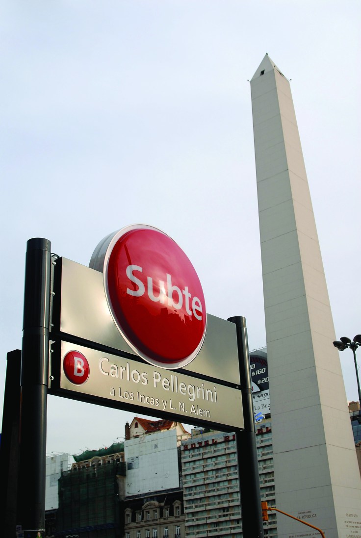
“Transformation” is the only word that describes the breadth of Diseño Shakespear’s engagement with Metrovías (the private operator of the system), starting with the rebranding of the system from the formal “Subterráneos de Buenos Aires” to the familiar and friendly “Subte.”
Shakespear reports that his greatest task in this 10-year project was to demonstrate the importance of this new and approachable brand and its position as the emblem of the new signage system. To overcome his client’s desire to use Metrovías in the name, was “half the battle.”
That battle was won, and today Metrovías CEO Alberto Verra cherishes the new brand: “we understand that the subway belongs to the city and its people and they call it ‘Subte’ which is unique — it’s an icon of Buenos Aires.”
The first round of work began in 1995 and focused on identity, interior signage, and map redesign for the system of five lines. (A sixth has been added since then.) Ronald and his sons Lorenzo and Juan employed their typical project methodology of “research, analysis, synthesis, drafts, final project, implementation.” Lorenzo visited the major subway systems of the world and returned to the studio with the best and worst of system design. Alberta Verra describes the Shakespears’ work process as “creativity derived through understanding.”
For the design of the map, which would become an iconic guide to the system, the team was inspired by Henry C. Beck’s 1933 diagrammatic map of the London Underground. At Beck’s time, it was a radical notion to ignore the actual topology of the subway lines and abstract the network into a more simplified and accessible geometry. By limiting themselves to vertical, horizontal and 45-degree angles, then adding an underlay of major streets above (another novel approach), the Shakespear team generated a map that was comprehensible as well as beautiful. Place it next to Massimo Vignelli’s New York Subway system map, and you discover another important influence in their work.
Composing the subway station
The next challenge was the interior station signage. Through a combination of observational research and what Ronald calls “verified intuition,” the team prioritized the goals that the signage must accomplish. The studio adheres to two fundamental tenets of wayfinding:
The signs must be easy to find and their locations predictable.
The signs must be easy to understand.
The experience of riding the subway introduced a third tenet derived from rider observation: the most important signs are those that direct visitors to the exit, up and out to street level. Ronald explains that designers have the obligation “to listen to people, to decipher their codes, to discover their yearnings, and to give them an answer.” With that in mind, the team uncovered an anxiety about traveling underground and a compulsion to exit the system as soon as possible. Ronald explains: “The exit sign is the most important symbol to people on the subway: How do you escape? It is unnatural to be underground in the city.”
The team used these principles to create a grid system of sign types and a hierarchy of information that could be applied to the various conditions of the system’s 86 subway stations. Station identifiers that run in bands along the tracks are always located at the same height — 2.2 meters from the platform floor — to provide optimum viewing from inside the subway car. All signs are parallel with the subway car, again for maximum visibility, except for those critical signs that guide people to the exits. They are perpendicular to the tracks and feature clear, simple messages. There are a total of 41 signs per station in a standard configuration.
The visual language for the Subte is bold and concise. A palette of six strong colors are used to brand the six lines and white Frutiger type is used at various weights for optimum legibility.
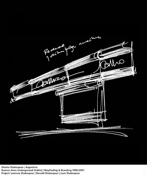
To balance the rigor of type and color choices, each sign is capped with a cylindrical header of the line color, providing a flourish of detail above the informational content. The header extends over the advertising space that punctuates each stop, providing a unifying element — or “perpetual belt” of 220 meters as Shakespear refers to it — to the station interior. He reports that it was difficult to convey the importance of this master element that repeats the station name every 2.5 meters, and yet it is one of the most reassuring elements of the system to riders looking for their stop.
During the design phase, full-scale prototypes of the interior signage system were installed at two stations. A most productive, yet expensive step in the project, Ronald explains “A prototype is very useful. It proves it works. It proves to me it works.”
All the interior signage is composed of 2mm-thick aluminum panels and extruded cylinders with a polyurethane coating and applied vinyl graphics.
Above the tunnels: appointing the entrances
In 2006, the project advanced with the complete replacement of all exterior Subte signage. Since the oldest station is almost 100 years old, there was a great variety of subway entrance conditions and entry signage. Many entrances sported filigreed ironwork and ornate lettering.
The Shakespear team chose to adapt the visual design elements used in the interior signage, reassembling them in the grand scale required to identify stations on Buenos Aires’ busy streets and wide boulevards. The circle that identified the various lines on interior signage was made three dimensional and illuminated to become a recognizable beacon hovering above the streetscape. The cylindrical caps were rotated to become pillars supporting the spherical landmark. This economy of design appears effortless, as if it were the only logical conclusion to the design problem at hand.
Exterior entrance signs are composed of sign boxes formed by standard aluminum extrusion and double faced acrylic signs illuminated internally with long-life lighting elements chosen high visibility and low maintenance. Each entrance features a color vinyl system map illuminated from behind and mounted in aluminum frames and iron columns.
For both the internal and external elements, the fabricator, Acrílicos Atlas SA. of Buenos Aires, led the substantial fabrication and installation effort totaling over 3,500 signs in all.
In a city where the bus system can take years to master, the Subte is recognized as the easiest way to navigate a city known for the widest streets in the world — and a fair share of traffic congestion. A large part of that ease comes from the absolutely clear visual structure of Diseño Shakespear’s wayfinding system.
But perhaps a less tangible quality — the inherent suitability of the system as a whole — is what has made the Subte brand an inviting, authentic and reliable element of the city. With a daily ridership of 1.3 million , the Subte has become a subject of pride for porteños. “As in chemistry,” Ronald says, “design acts like an agent, synthesizing deep changes in the state of things.”
Leslie Wolke (leslie.wolke@gmail.com) is a consultant who specializes in interactive wayfinding and donor recognition systems. Based in Austin, Wolke writes about design and architecture. She had the pleasure of meeting Ronald on a recent trip to Buenos Aires. With her husband and her Subtepass, she traveled all the major lines like a porteño.
![]() Illuminating the Underground: A Profile of the Buenos Aires Subway System, (PDF) published in segdDESIGN, no. 20, 2008
Illuminating the Underground: A Profile of the Buenos Aires Subway System, (PDF) published in segdDESIGN, no. 20, 2008
Project Brief
Client:
Metrovias SA.
Location:
Buenos Aires
Design:
Diseño Shakespear Argentina.
Design Team:
Lorenzo Shakespear / Director
Juan Shakespear / Director
Ronald Shakespear / Director
Joaquín Viramonte / Designer
Gonzalo Strasser / Architect
Cecilia Bonnefón / Designer
Juan José Aguiló / Designer
Lucía Diaz / Public relations
Javier Fava / Administration
Juan Cerdá / Legal Advisor
Luis Travi / Chief Administrator
Consultants:
Victor Levy Ing. / Watson&Levy / Legal Consultant.
Fernando Estevez / Fabrication Consultant.
Fabrication:
Acrílicos Atlas SA.
Photos:
Juan Hitters
Lorenzo Shakespear
Hector Calderone


